Naskh
النسخ
I'm the script you've been reading without noticing.
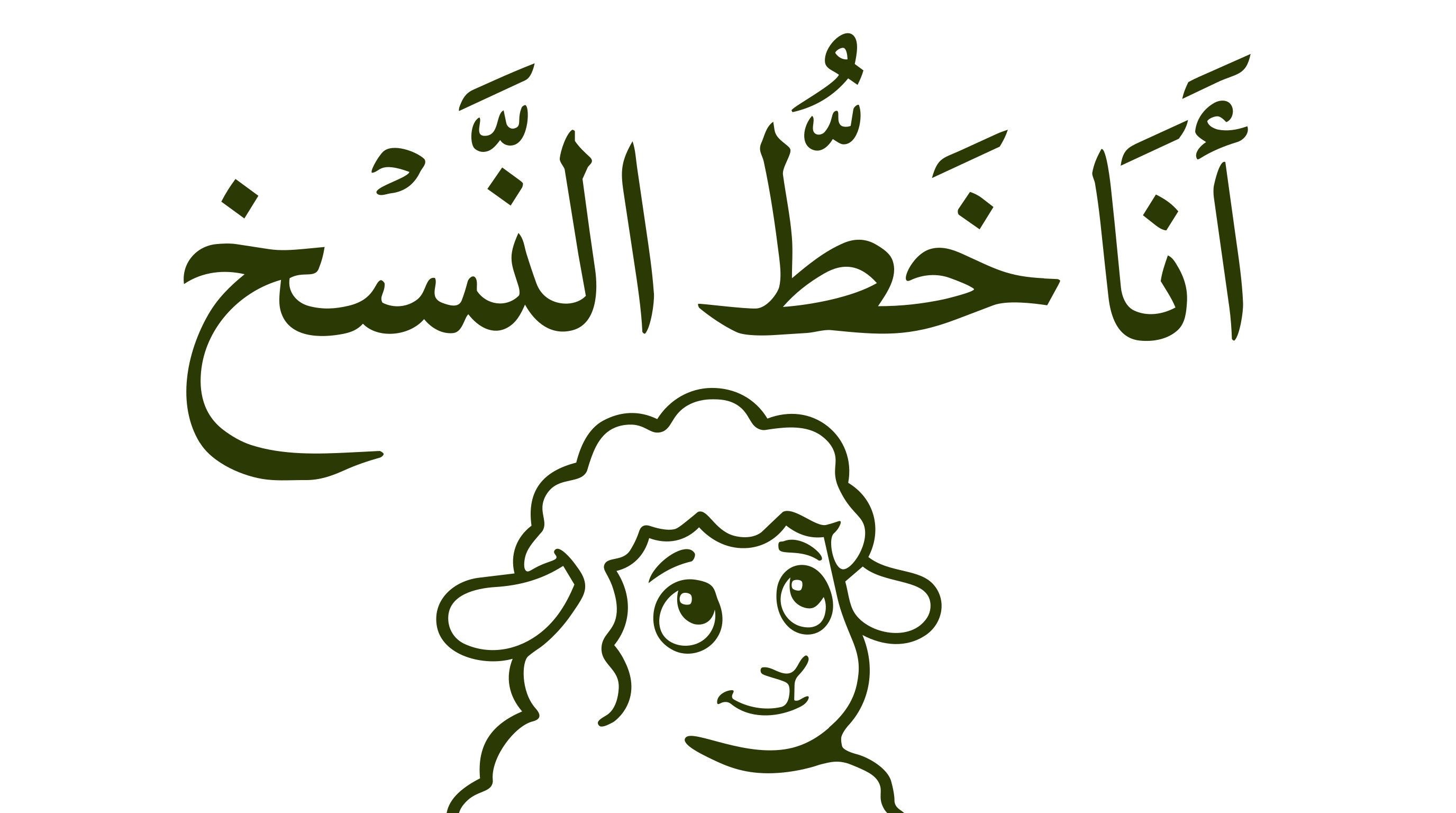
I'm Naskh, round, even, easy to follow. If you've ever read an Arabic book, newspaper, or website, you were probably reading me. I was built for clarity at small sizes during the Abbasid era, and most modern Arabic text fonts still copy my logic, even when they pretend to be brand-new.
Visual Character
Naskh is known for its rounded forms, steady proportions, and clear letter differentiation, especially in smaller sizes. Its rhythm tends to feel even and controlled, which is why it became a dominant choice for manuscripts and later for printed Arabic text. Many contemporary Arabic "text" fonts still build on Naskh logic, even when the style is modernized.